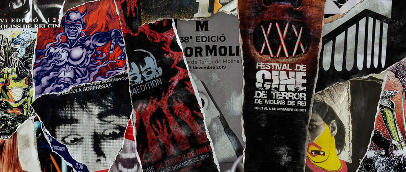
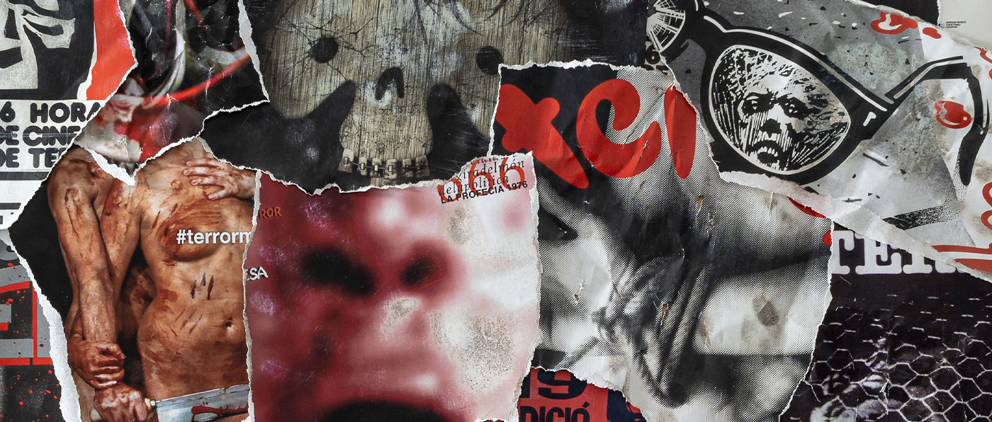
Here are the posters from all the editions of the history of the Festival that we have been able to find so far. Some of them might be missing because of the manintenance dificulties of older documents.
AUTHOR
Andreu Gallart
with the collaboration of Joan Jarque, Anna Aguilera and the photography by Joan Gosa.
high resolution download
What was the creative process for the poster like?
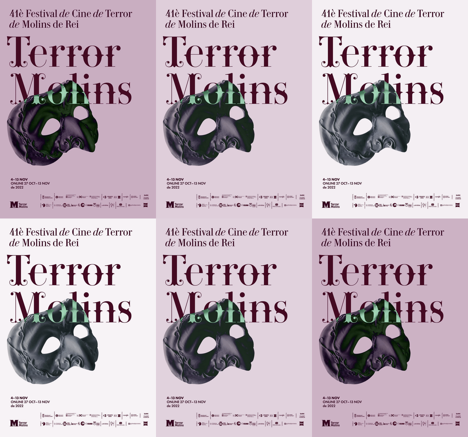
The poster, made by renowned designer Andreu Gallart with the collaboration of Joan Jarque and Anna Aguilera and photography by Joan Gosa, refers to the classic stories of terror and music, headed by the Phantom of the Opera. The mask as a theatrical and operatic element, but also as an object of concealment and mystery, is the protagonist of a clean and minimalist composition behind which hides a new batch of the most terrifying and disturbing cinema. Gallart is the author of the festival’s logo, and he plays with a merging of masks and fonts including two versions of the poster -in a day and night fashion-, which set a dark and ghostlike sense.
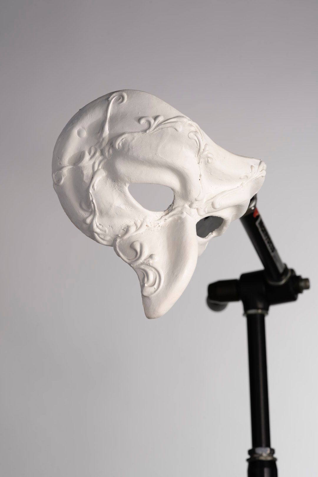
“We commissioned a Venetian mask that was reminiscent of the Phantom of the Opera but not in an exact way, as we didn’t want to tie it to just one movie. We painted it white and photographed it to include it in the poster.
To chose the typography, we did not want to continue with the neutral letters and big logo of previous editions, but instead we went to rather classic typefaces and made an ornate version, which connects you with the codes of classical opera; then we put the word “terrormolins” so that when it interacts with the mask it takes on a greenish tone that in the popular imagination can refer us to the phantasmagorical world.
Finally, we have played with these two versions at night and during the day. Or dark and light. Depending on the version, the mask takes on a much darker look, although the ghostly tone is maintained in both. This can give play when it comes to concatenating them and making contrasts, for example in street flag-banners.”
BEHIND THE SCENES
About the authors:
Andreu Gallard. Art director specialized in corporate image, editorial design and illustration. He combines his work as art director at the Conga studio with his own solo graphic design projects. He has been awarded several times in the Laus and Aspid awards. He has collaborated, along with other renowned professionals in the sector, in the development of various corporate image projects such as the redesign of the Laboratorios Ferrer brand, the new art direction for the Re-Read bookstore chain or the institutional communication of Infrastructures of the Generalitat de Catalunya.
Joan Gosa. Multidisciplinary professional freelance photographer. He considers himself a traveler who is passionate about the cultures of the world and the relationship between man and nature, preferring mountainous environments. He combines his great passion for traveling with his work as a sports and news photojournalist for a major news agency. He has his own photographic studio where he develops his personal and professional projects together with his clients. Collaborating photographer in sporting and social events for the international news agency Xinhua (China) in Catalonia.
Joan Jarque. Born in Molins, he defines himself as a multidisciplinary designer in love with graphic design, video-mapping and horror films. His involvement with TerrorMolins began in 2014 as a translator, and he currently is its official designer. He also collaborates in the direction of the Festival’s communication, within the communication and marketing department, as well as in the creation and realization of live video-mappings during the days in which the event is held. He works as a freelance designer and creative producer and is also a freelance graphic designer for various brands. His relationship with TerrorMolins began in 2001, when he atended the Festival with his parents, also great lovers of this appointment with the genre cinema. It is clear that horror belongs to his DNA.
AUTHOR
Joan Gosa and Joan Jarque
FACTS
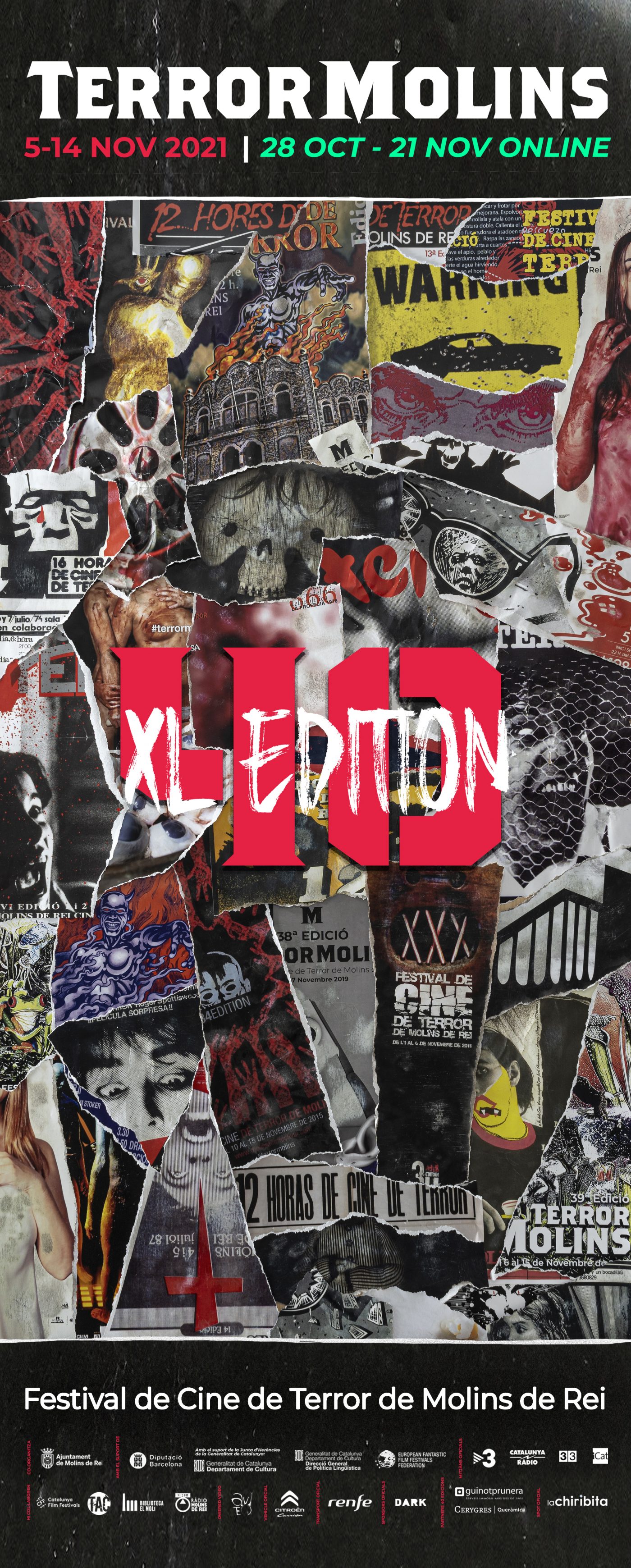
Collage made manually – and then photographed – with posters from different editions of the Festival, with a style inspired by the aesthetics of the counterculture (leitmotif of that edition). Its aspect ratio is unusual and seek to mark the difference in this celebration of the 40 editions of the festival.
high resolution download
What was the creative process for the poster like?
As you know the leitmotif of this edition is Counterculture and the poster of the 40th edition is based on that concept. We wanted to make a tribute to all our posters, as well as a tribute to that search for a new view to break away from the authoritarian society, typical of the decade that saw the birth of the Festival in that distant 1973. We opted for a large hand made collage, then photographed and digitally formatted. It takes us to the seventies posters and the counterculture movement of that time.
VIDEO BEHIND THE SCENES
About the authors:
Joan Gosa, born in Pallejá, is a professional freelance photographer. He defines himself as passionate about world cultures and the relationship between man and nature. He combines his great passion for travel with his work as a sports and news photojournalist for a major news agency. He has his own photographic studio, where he develops his personal and professional projects with his customers. His relationship with TerrorMolins began in 2017, attending as official photographer; from that moment he became a vital part of the Festival.
Joan Jarque, born in Molins, defines himself as a multidisciplinary designer passionate about video-mapping and horror cinema. His involvement with TerrorMolins began in 2014 as a translator, and he currently is its official designer. He also collaborates in the direction of the Festival’s communication, within the communication and marketing department, as well as in the creation and realization of live video-mappings during the days in which the event is held. He works as a creative producer for the Framemov studio and is also a freelance graphic designer for various brands. His relationship with TerrorMolins began in 2001, when he atended the Festival with his parents, also great lovers of this appointment with the genre cinema. It is clear that horror belongs to his DNA.
AUTHOR
Joan Jarque
FACTS
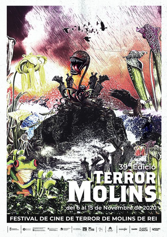
it is inspired in the leitmotiv “La Naturaleza se Rebela”. It also appeared on the cover of the book of the Festival with the same title
AUTHOR
Joan Jarque
FACTS
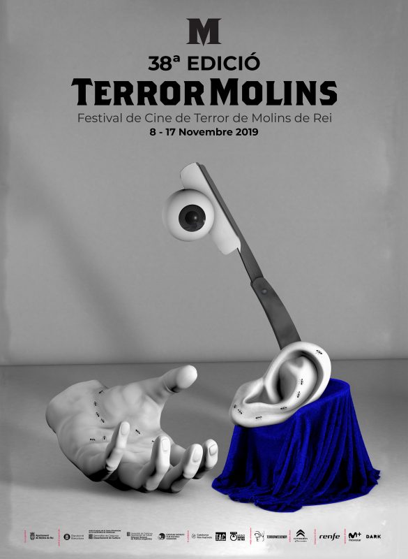
it is inspired in the leitmotiv of surrealisme in horror cinema. It was also a cover of the book of the Festival of that year
AUTHOR
Maite Pascual
ANÉCDOTAS
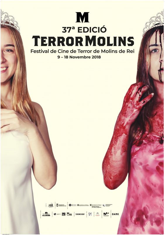
inspired on the film “Carrie (1976)”, in connection with the review the Festival did on Brian de Palma’s life and production. It included the issue of a monographic book
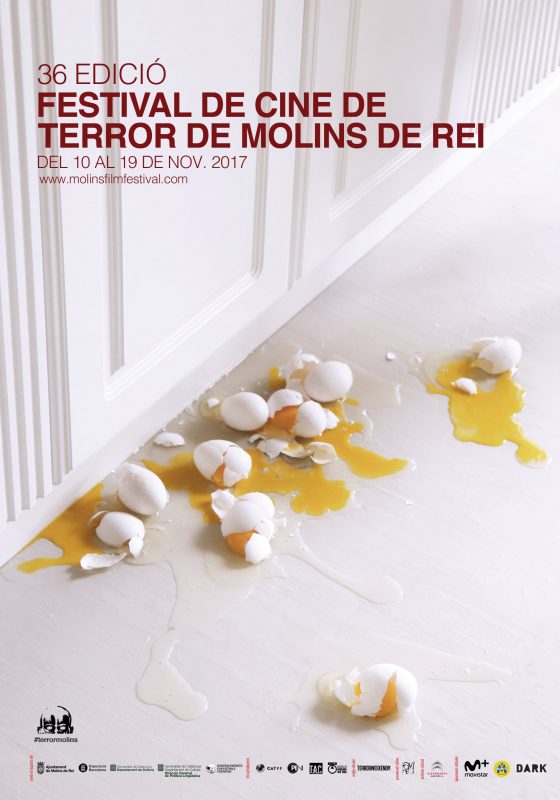
AUTHOR
Maite Pascual
FACTS
inspired on the film “Funny Games (1997)”, in connection with the revision that the Festival did on its director Michael Haneke (there was a monographic book, too)
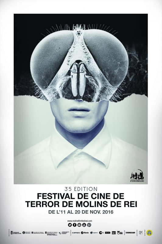
AUTHOR
Maite Pascual
ANÉCDOTASi
inspired on the leitmotiv of mutations in horror films. It was cover of the book that the Festival issued on the topic
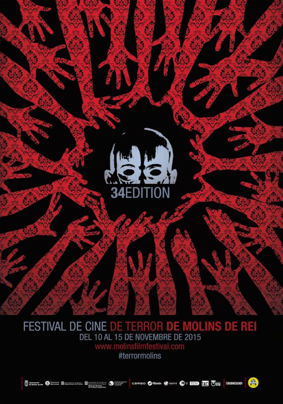
AUTHOR
Maite Pascual
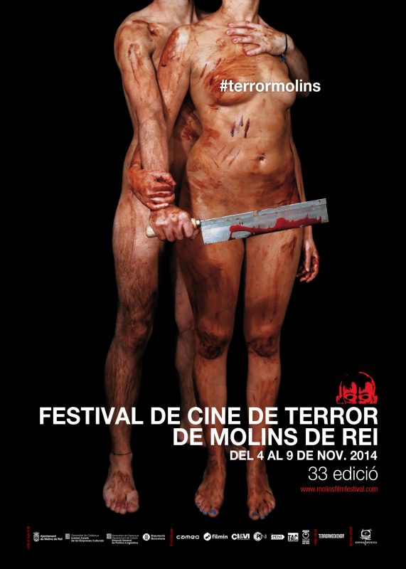
AUTHOR
Maite Pascual
FACTS
inspired in the leitmotiv of erotism in horror films

AUTHOR
Maite Pascual
ANÉCDOTAS
inspired in the leitmotiv of censorship against horror films
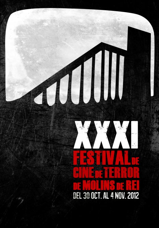
AUTHOR
Maite Pascual
FACTS
first of the seven consecutive contribution of the author and first Festival woman designed poster
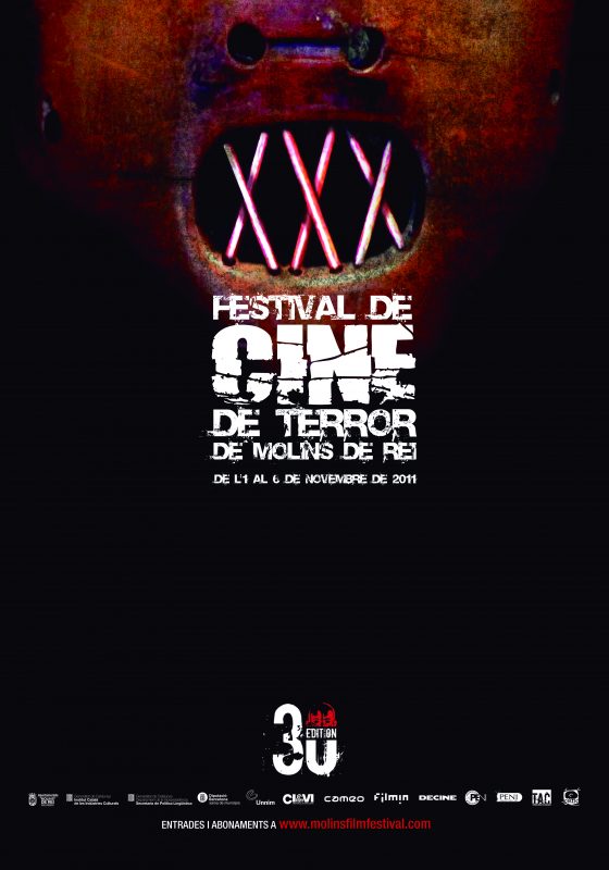
AUTHOR
Raúl López
FACTS
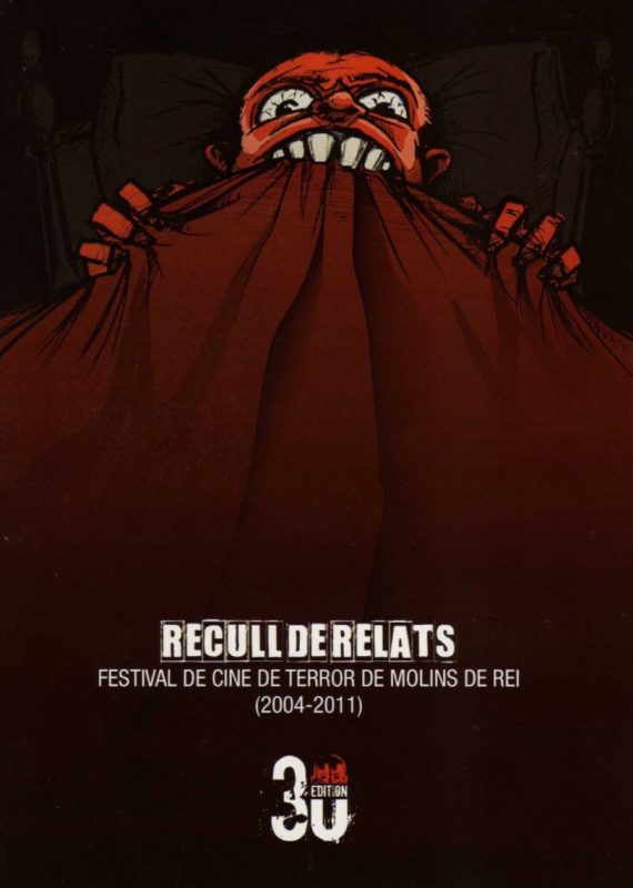
winner of the third poster contest,Raúl López made two such big posters that we decided to use the second one on the cover of the book of short stories issued that year (below)
And this was the official logo of the 30 editions:
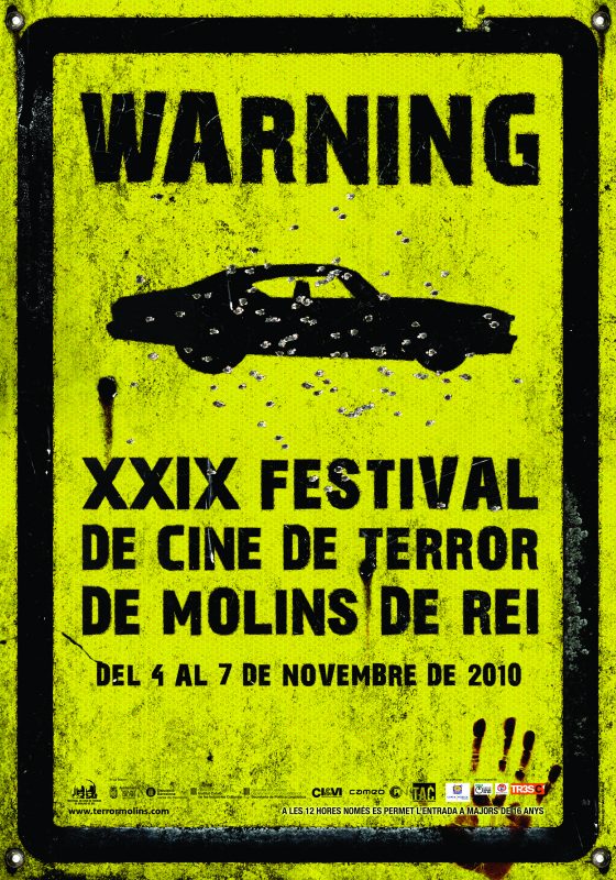
AUTHOR
Paco Ruiz
FACTS
winner of the second poster contest with the leitmotiv of roads
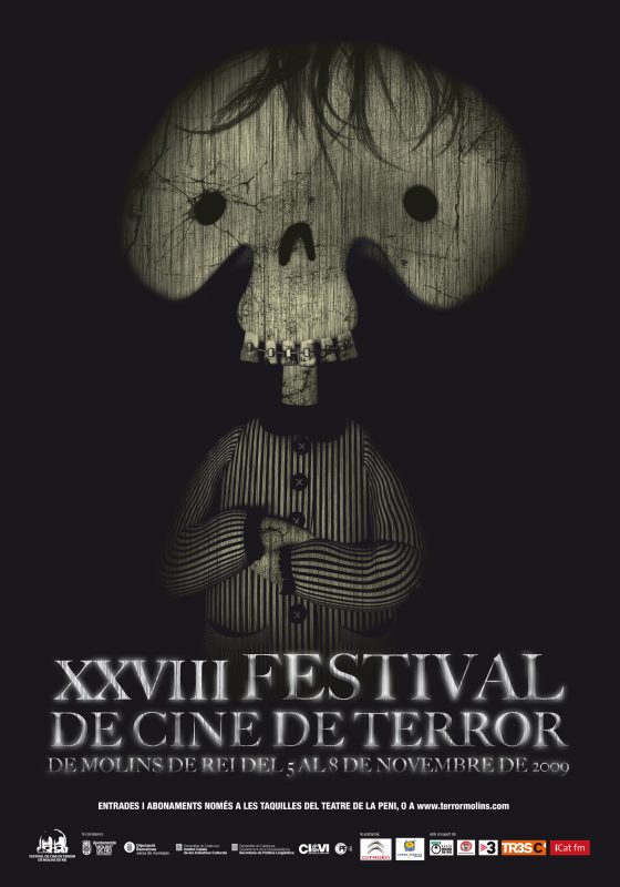
AUTHOR
Carles Gonzàlez
FACTS
winner of the first poster contest
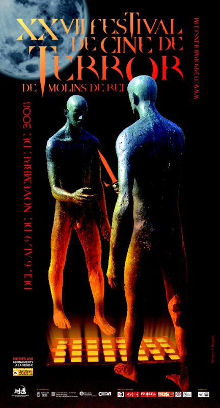
AUTHOR
Josep Bergadà
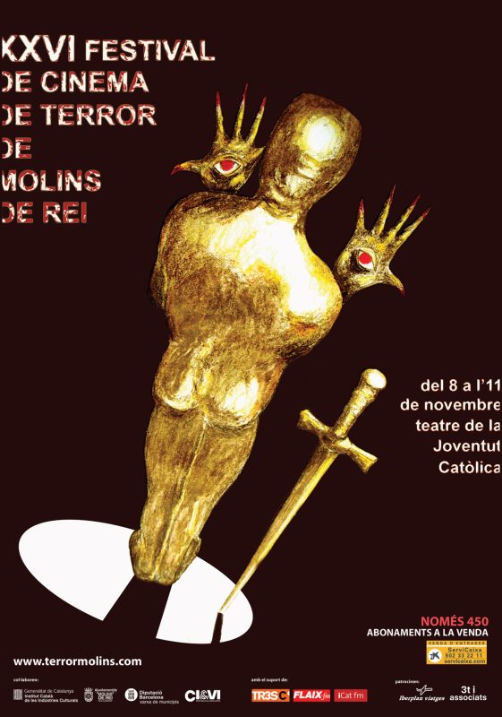
AUTHOR
Joan Guitart
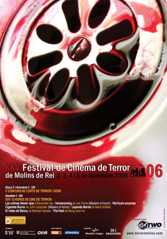
AUTHOR
Paco Ruiz
FACTS
see below and alternative work by the same author which was finally ruled out
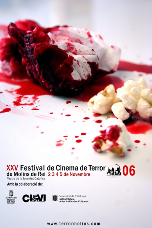
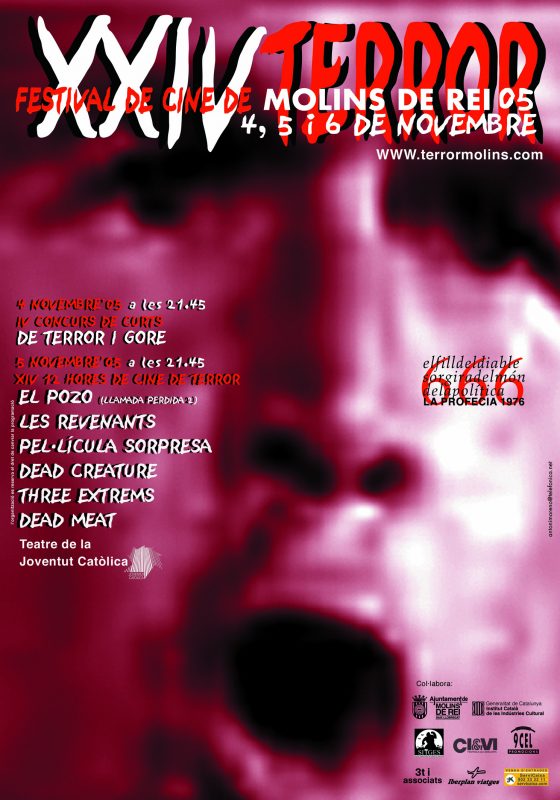
AUTHOR
Toni Moreno
FACTS
The poster finds its inspiration in Richard Donner’s The Omen (1976), particularly on the quotation that says “the son of the devil will raise from politics”. Thsi is George W. Bush’s face.
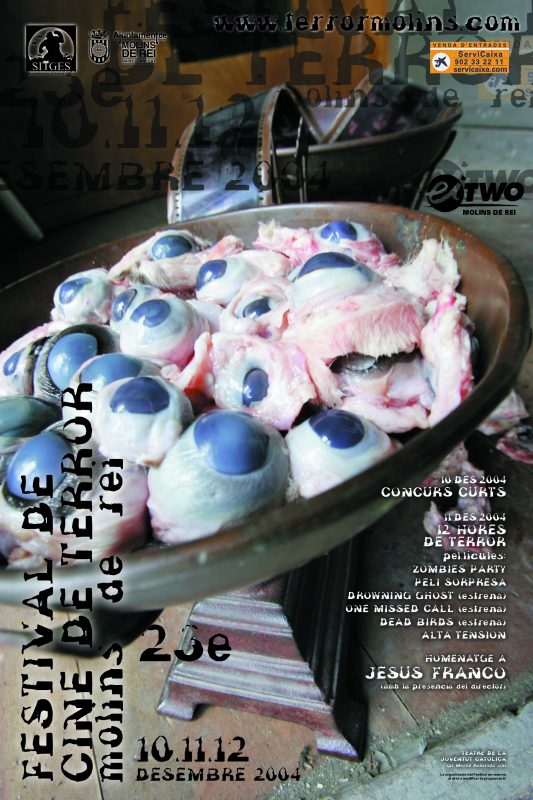
AUTHOR
Guillem Urbà, Roger Sàbat
AUTHOR
Antonio Andreu
FACTS
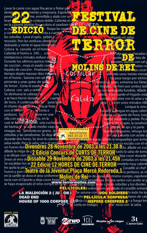
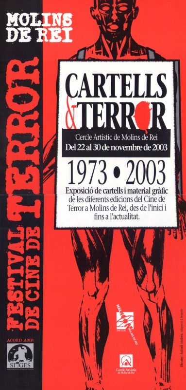
The background text is the recipe of how to cook a human body. However, what really matters is that the face shaped logo of the Festival comes from this poster. See below the poster of that year’s exhibition.
AUTHOR
Antonio Andreu
AUTHOR
Antonio Andreu
FACTS
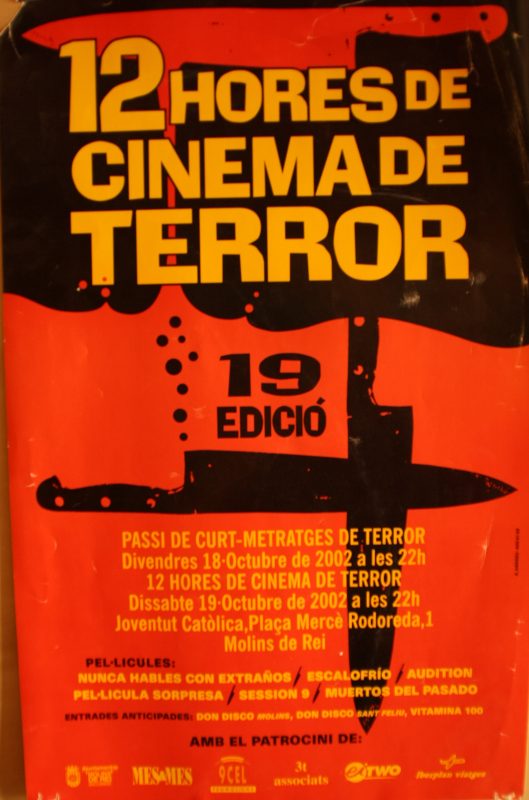
after an 8 year hiatus, the 12 Hores were back as well as the author of the last poster que got inspiration form the 1993 poster
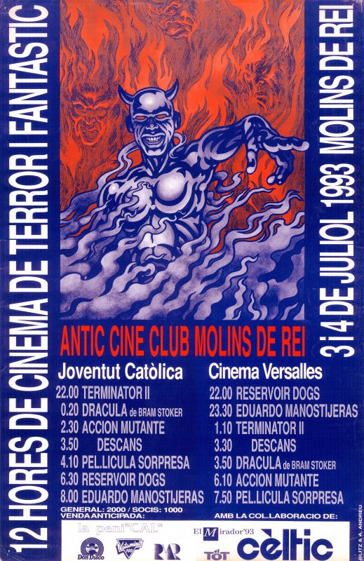
AUTHOR
Blitz & Antonio Andreu
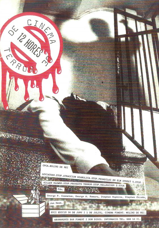
AUTHOR
Nico Solera
FACTS
the girls name is Ana Sanchez
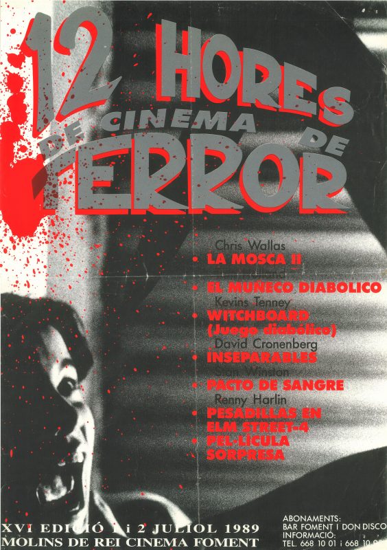
AUTHOR
Nico Solera
FACTS
the girl’s name is Ana Sanchez. The hand leaflet was slightly different (below)
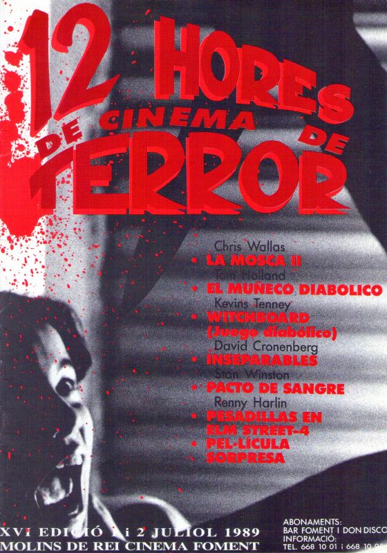
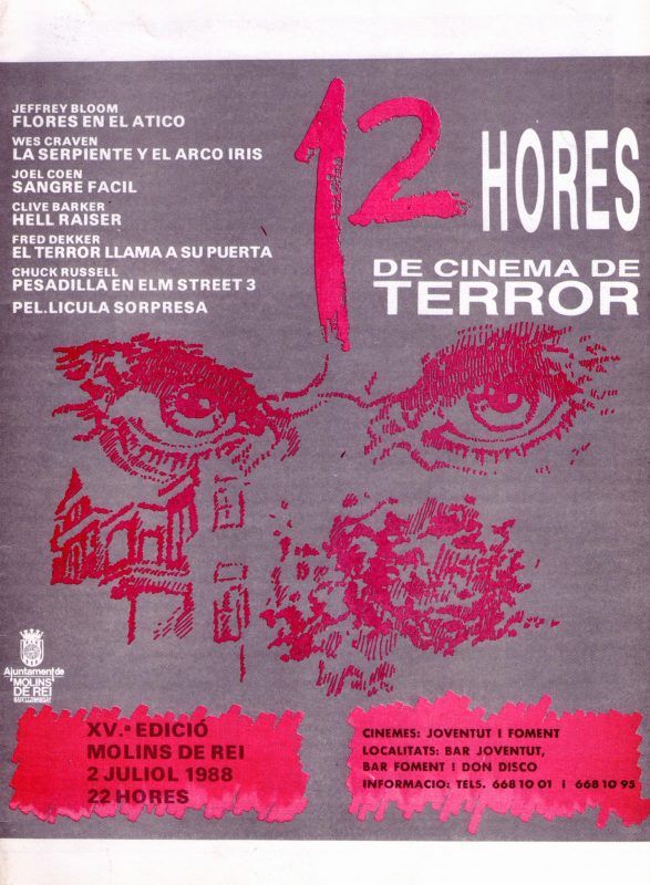
AUTHOR
— unknown —
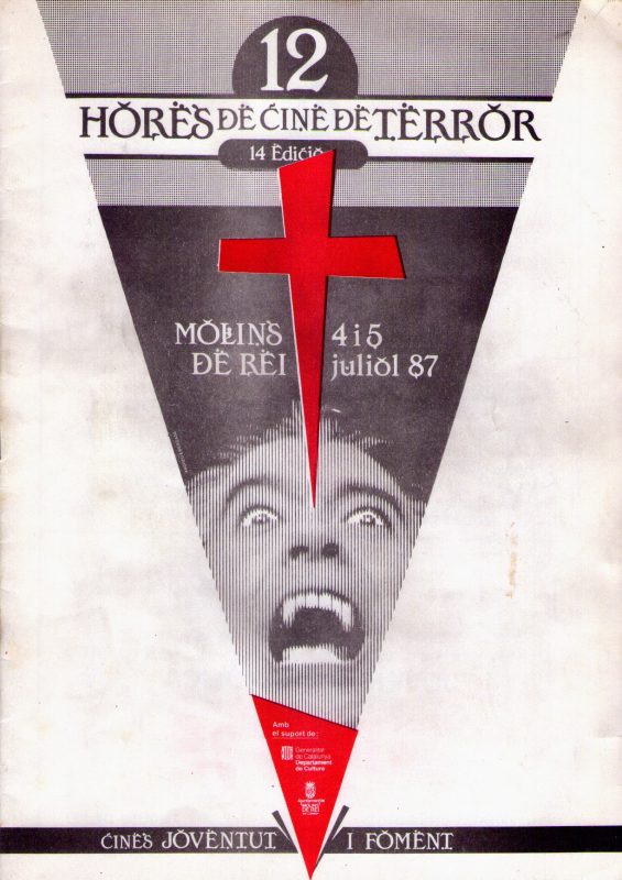
AUTHOR
Josep Bergadà
FACTS
tribute to Christopher Lee. The image shows the hand leaflet because the poster wes triangle shaped. It was one of a kind through all the Festival history
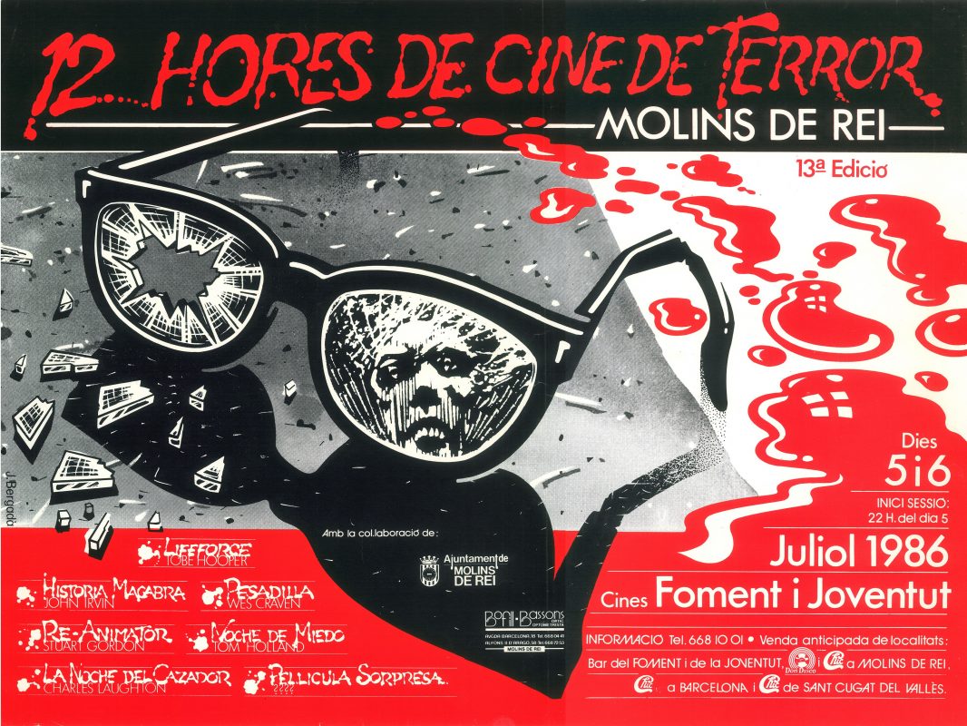
AUTHOR
Josep Bergadà
FACTS
the image below is a layout given to the Festival by the author on the 30 editions. It is a previous test that was never used

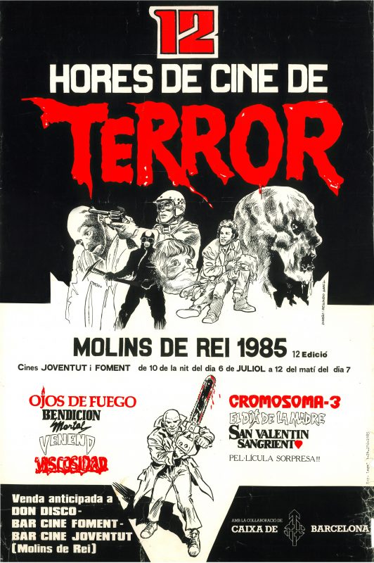
AUTHOR
Segundo Garcia
FACTS
the author came from the comic world, which is a clear influence in the poster design
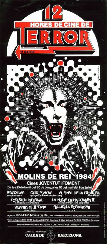
AUTHOR
Josep Bergadà
ANÉCDOTAS
the image below is a layout given by the author Josep Bergadà to the Festival on the 30 editions. It is an initial test which was never used.
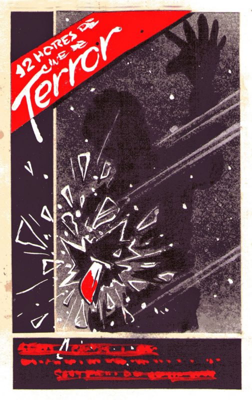
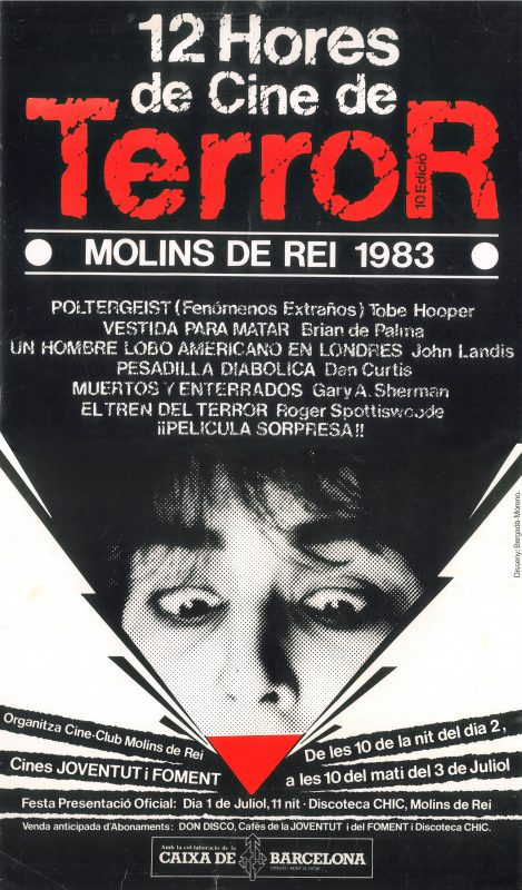
AUTHOR
Josep Bergadà, Toni Moreno
FACTS
Montse Baqués is on the picture
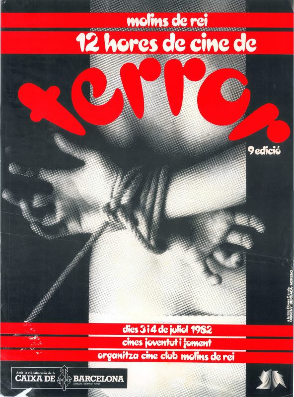
AUTHOR
Josep Bergadà, Toni Moreno
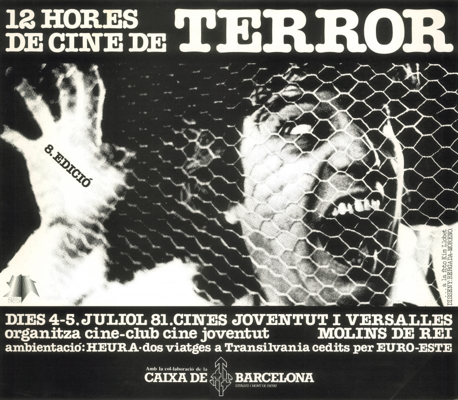
AUTHOR
Josep Bergadà, Toni Moreno
FACTS
en la foto, Quim Llobet
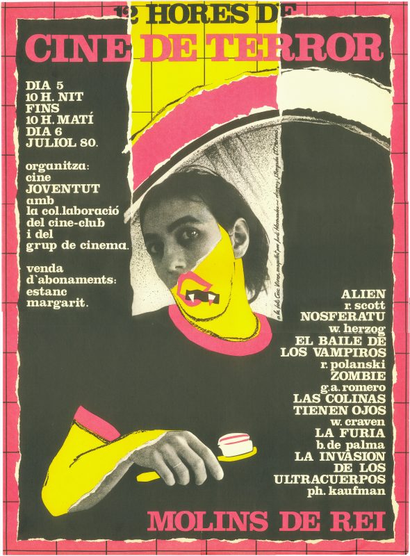
AUTORES
Josep Bergadà, Toni Moreno
FACTS
the picture shows Cesc Vives in a make up session by Jordi Hernández
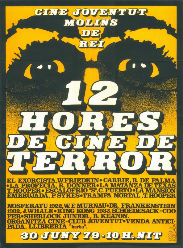
AUTHOR
Josep Bergadà
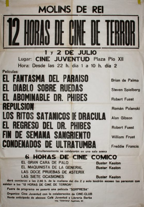
AUTHOR
Andreu Castañé, former member of the cineclub
FACTS
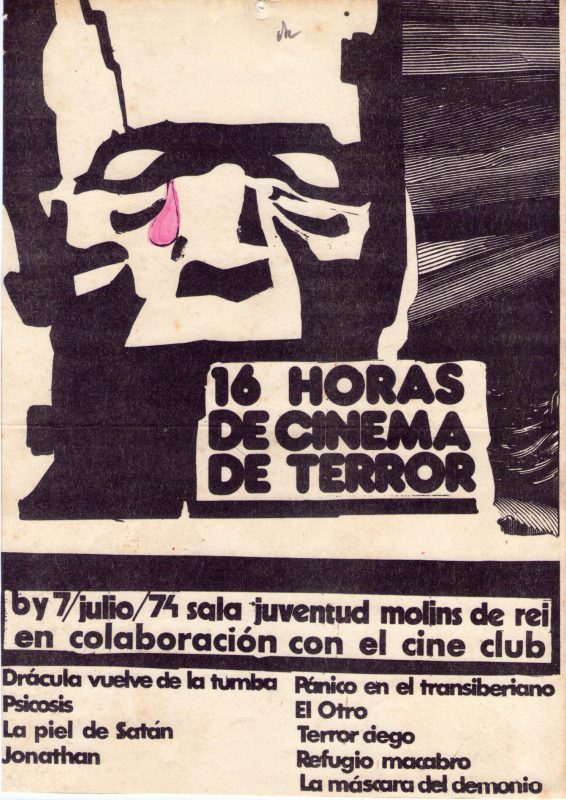
this red tear on Frankenstein’s eye was close to cause economic trouble to the organisation because it meant printing the poster on double inks instead of a single ink. There was finally a solution.

AUTHOR
Andreu Castañé, former member of the cineclub
AUTHOR
Andreu Castañé, former member of the cineclub
FACTS
this red tear on Frankenstein’s eye was close to cause economic trouble to the organisation because it meant printing the poster on double inks instead of a single ink. There was finally a solution.
— without information —
